We may not have the course you’re looking for. If you enquire or give us a call on +1 7204454674 and speak to our training experts, we may still be able to help with your training requirements.
Training Outcomes Within Your Budget!
We ensure quality, budget-alignment, and timely delivery by our expert instructors.
.png)
Have you ever wondered what makes Microsoft Excel so popular worldwide? Then, you must know that most people, including students, use Excel to complete their assignments and professionals to complete their everyday tasks. One significant feature that makes Excel this popular is the various Types of Charts in Excel.
Graphics are easier to grasp than boring numbers and texts, so Charts are valuable tools for Data Visualisation. Charts represent data graphically, making it easier for anyone to interpret it within seconds. Various Chart in Excel, such as List of Column Chart, Bar Chart, Area Chart, Line Chart, Surface Chart, Scatter Chart, Pie Chart, Stock Chart, Bubble Chart, and Radar Chart helps in communicating valuable insights when there are large volumes of data.
Data presented in Charts is easier to grasp than in an Excel table. Thus, you can work with Excel easily, even if you haven’t got any formal training. Excel offers a range of Charts, each with unique features and depiction methods. So, let’s understand how many Types of Charts are available in Excel and how to use them for the best results.
Sign up and learn the top 10 Excel shortcuts with our Microsoft Excel Masterclass!
Table of Contents
1) What are the Different Types of Charts in Excel?
a) Column Chart in Excel
b) Bar Chart in Excel
c) Area Chart in Excel
d) Line Chart in Excel
e) Surface Chart in Excel
f) Scatter Chart in Excel
g) Pie Chart in Excel
h) Stock Chart in Excel
I) Bubble Chart in Excel
j) Radar Chart in Excel
k) Doughnut Chart in Excel
l) Combo Chart in Excel
2) Types of Charts and their uses- Make logical chart selections
3) Conclusion
What are Different Types of Charts in Excel?
When you want to show any type of data for interpretation, the best way is to show it through Charts. Data analysis through Charts is interactive and has the potential to impress anyone. Although there are many tools available for making Charts and graphs, Microsoft Excel is still one of the most widely used tools. It enables you to visualise data in any format that you choose. The various Types of Charts in MS Excel include Pie Charts, Pivot chart, Line Charts, Stock Charts, Surface Charts, Waterfall Chart, Gantt Chart, and many more.
.png)
Now, let's move ahead to understand the various Charts provided by Excel and how to use them:
Column Chart in Excel
Column Chart uses vertical bars to represent data in a comparative manner. The bars in this chart compare data points. One set of data segmented into categories is the most typical subset used to show through Column Charts.
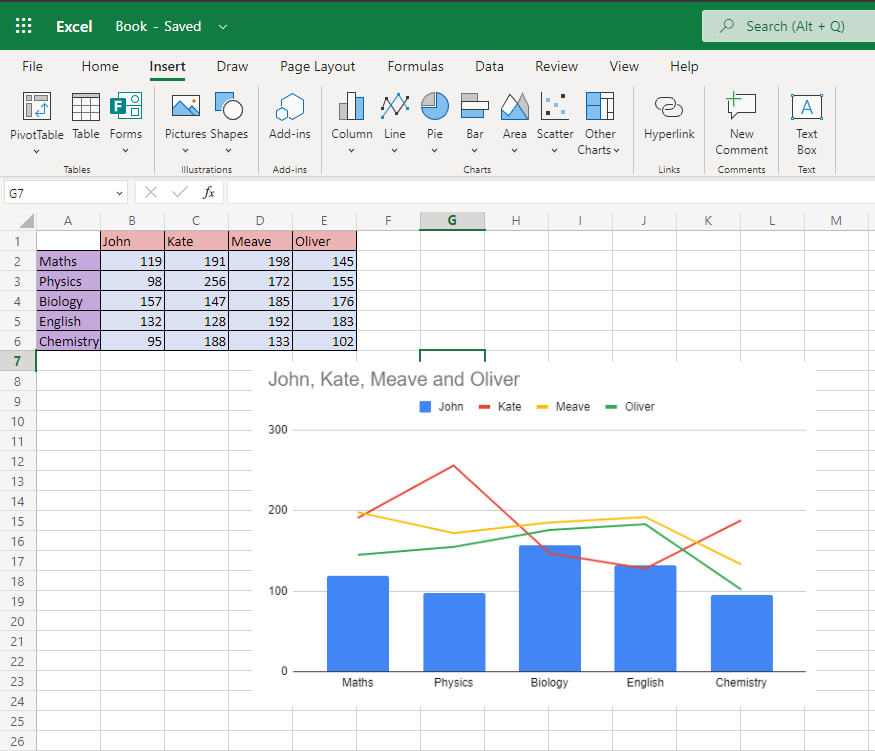
To see how Column Charts are used, let's take the data of students' marks in an exam out of 200 in each subject.
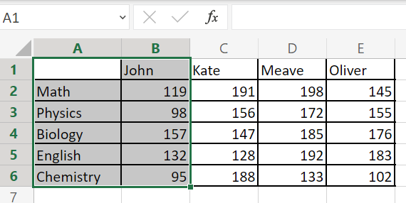
Here, we have taken the marks scored by John to display in a graphical format. Once you select the data, click insert at the top of the Excel sheet. Now, you will see all the Types of Charts available. You can choose either a 2D or 3D column from these.
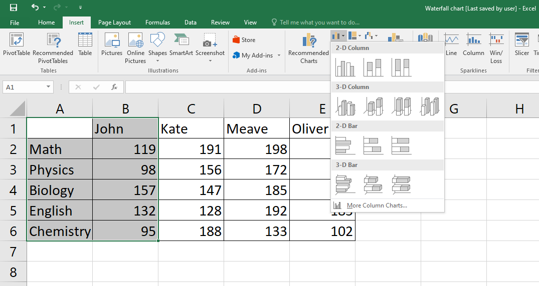
This is how your Column Chart will look like if you choose to show it in a 3D column.
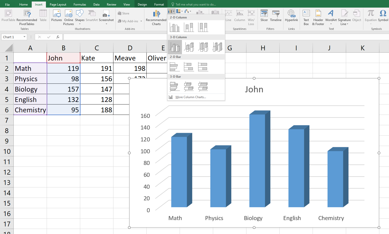
But remember that the Column Chart does not show automatic labels. You have to put in these by clicking on the + sign beside the chart. Now make sure Axis Titles are selected and select only Primary Vertical.
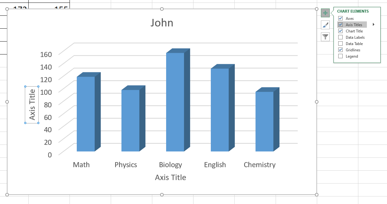
Now, you can easily comprehend that John scored the maximum in Biology. Next, we will see how John’s marks are compared to other students using a Bar Chart.
Bar Chart in Excel
The Bar Chart is similar to the Column Chart. The only difference is that in the Bar Chart, the bars are horizontal instead of vertical. In order to show John’s marks compared to other students, you will have to select all the data. Then click on insert and select the 3D Bar Chart as shown below.
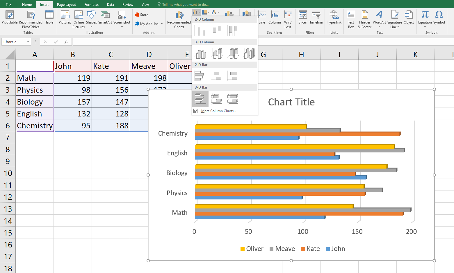
As you can see, Column Charts and Bar Charts are fantastic methods to compare categorised data inside a single data collection or between different data sets. The height and length of the bars in these Charts are proportional to the data values you want to represent.
Area Chart in Excel
Area Charts can be used to show the ups and downs of a given set of data. This Chart is usually used to indicate business growth. To show your data in the area chart, select the entire data and click on insert. Then, click on the Area Chart icon in the charts section and select the 3D area chart. Also, you can show your data in the 2D format, even in an Area Chart.
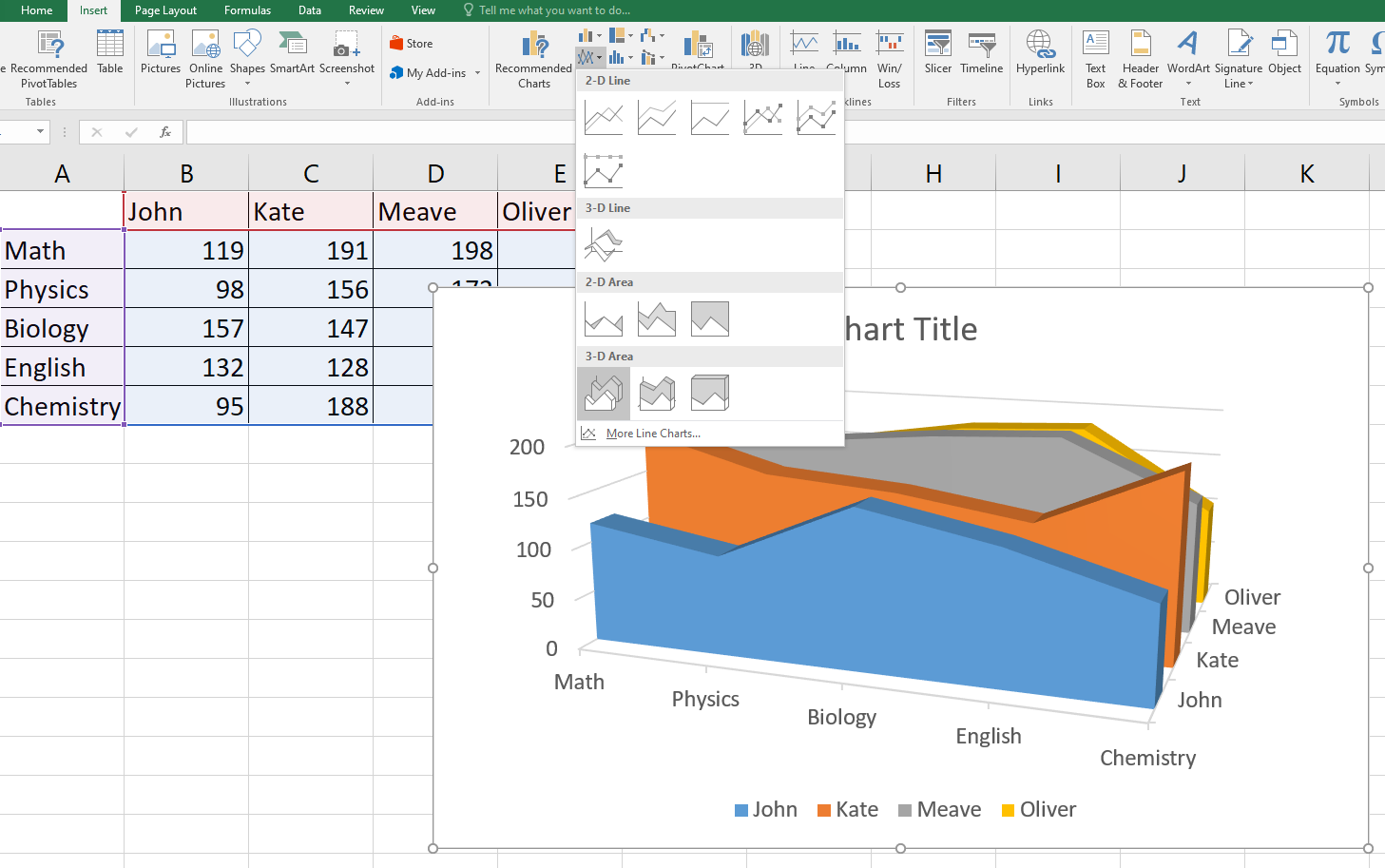
Build your career as a Data Analyst and learn to prepare tables. Charts, sheets and reports with our Data Analysis Training using MS Excel!
Line Chart in Excel
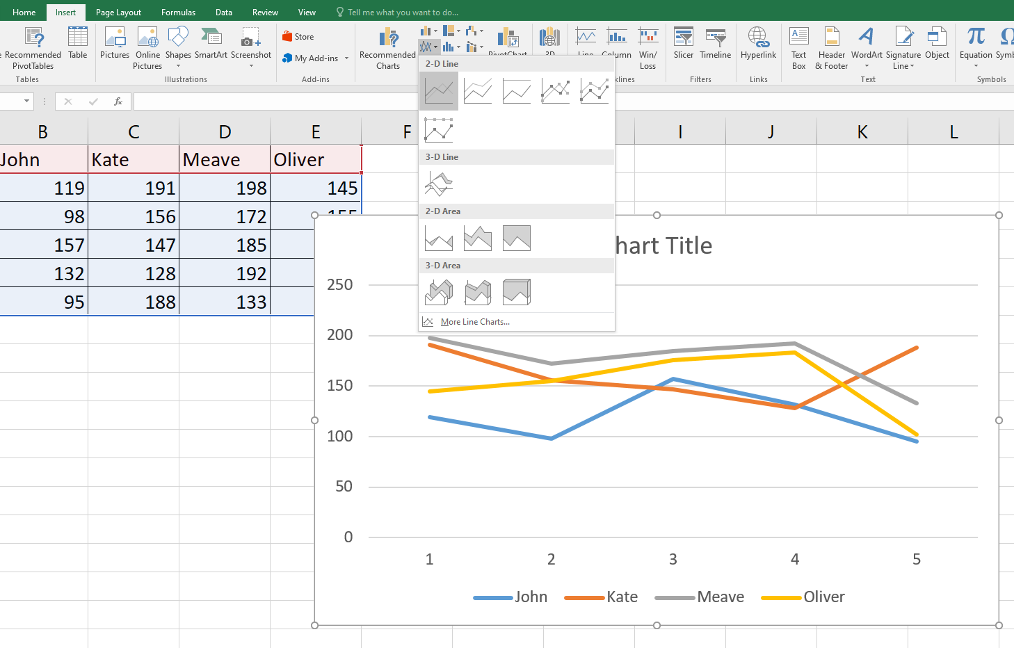
The best use of Line Charts is to display trends. Using this graph, you may quickly examine the ups and downs in your data. Lines connect data points in this graph. Here we will use Line Charts to show the trends between the marks of one student to the other.
Same as earlier, go to insert and click on Line charts to display your data in the Line Chart.
Surface Chart in Excel
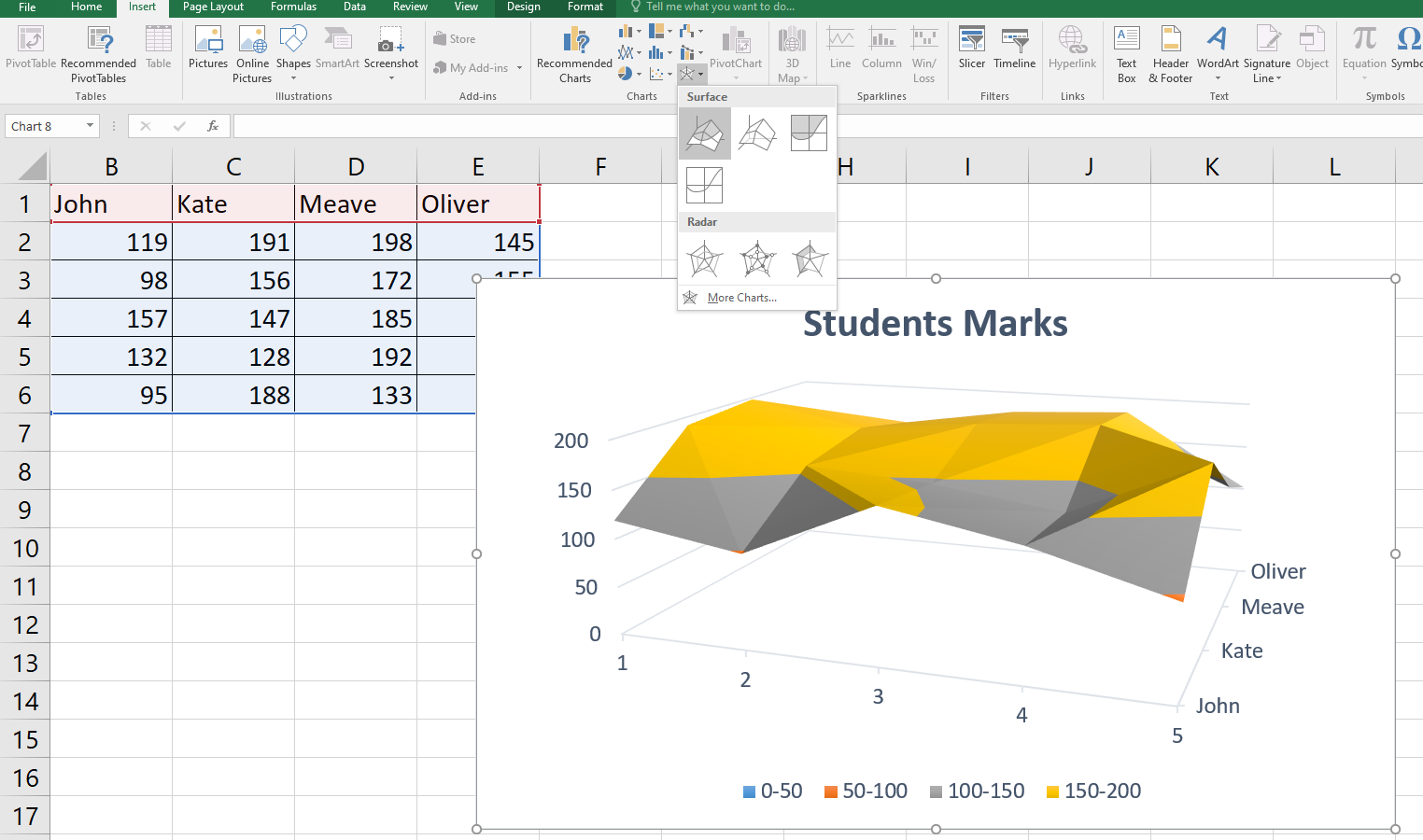
A Surface Chart can be helpful when determining the best combinations of two sets of data. For instance, a topographic map, patterns and colours identify regions within the same value range.
While making a Surface Chart, make sure the data series and the categories are both numerical values. A Surface Chart offers a 3D landscape to represent your data. You can use the Surface Chart for large Data sets to display all of them at once.
To display your data in Surface Chart format, go to insert and click on Surface Charts, as shown below.
Scatter Chart in Excel
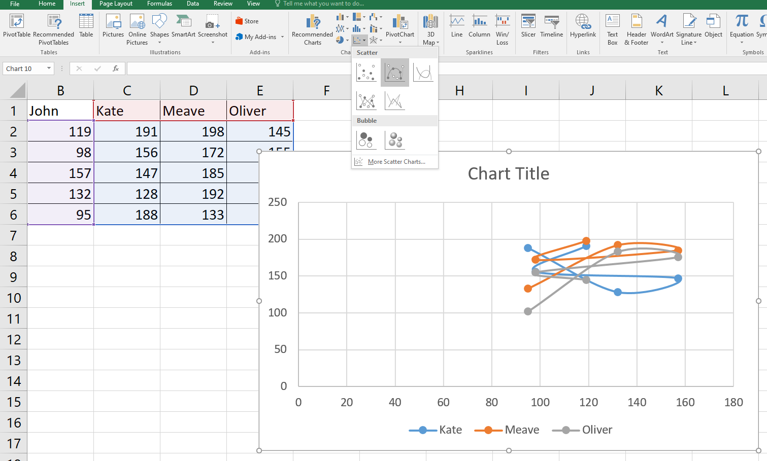
In simple words, a Scatter Chart is used to plot data on the coordinates. To use a Scatter Chart, go to insert and select Scatter Chart as shown below
Learn the procedures of Microsoft Excel VBA and Macro; join in for our Microsoft Excel VBA And Macro Training course now!
Pie Chart in Excel
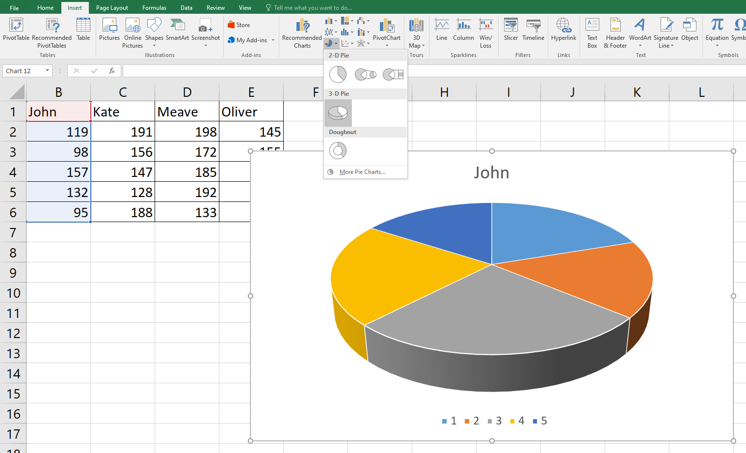
Pie Charts are named so because these look like a pie. They work best when you need to illustrate how much of a larger, dominating category is occupied by more specific subcategories. In a Pie Chart, the data points are shown as a percentage of the entire pie.
To understand How to Make a Pie Chart in Excel, let’s see what John’s marks distribution looks like on a Pie Chart. For this, select the data, and as usual, go to insert and click on Pie Charts. Pie charts also give you the option to display your data either in 2D or 3D format.
Radar Chart in Excel
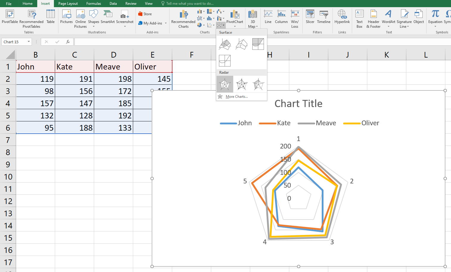
Similar to a spider web, a Radar Chart is also known as a Web Chart. The aggregate values of various data series can be compared using Radar Charts.
Go to insert and select Radar Chart to display your data, as shown below.
Doughnut Chart in Excel
A Doughnut Chart in Excel represents the size of items in a data series proportional to the sum of the items. It is similar to a Pie Chart; however, the Doughnut Chart comprises of more than one data series.
A Doughnut Chart is only used when there are multiple data series, but no more than seven categories. Also, the values of the cells should not be negative and almost none of the data series must be zero. Let's see how can we create a Doughnut Chart in Excel and simplify data.
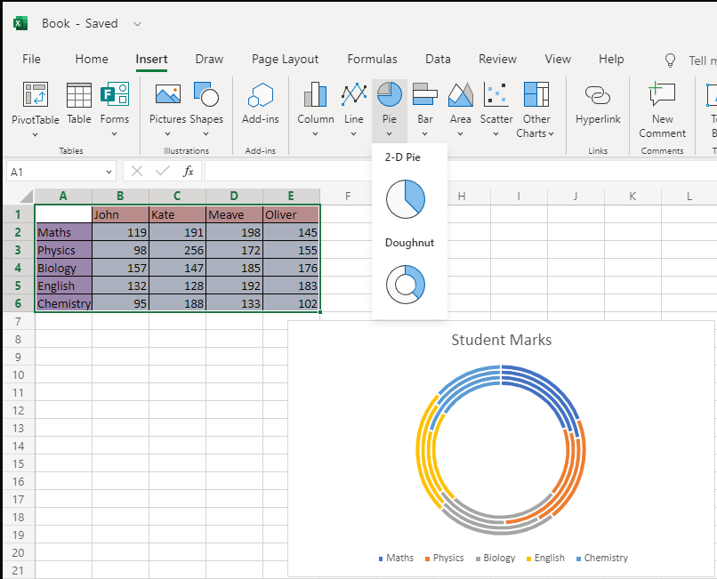
The Chart will represent data in the form of rings, where each ring displays a data series. In case of percentages in the data labels, each ring will represent at total of 100 per cent. Now, let’s see how can we create a Doughnut Chart using Excel sheet.
1) Step one is to enter the data in the rows and columns on the workbook
2) Next, select the data
3) Now, click on the Insert tab, and from the Charts group click on the Pie Chart option on the ribbon. Here, you will find the Doughnut Chart option also
4) Just click on the doughnut Icon and you will have a Doughnut Chart prepared for you
You can also edit the title of the Chart as per your requirements
Combo Chart in Excel
As the name suggests, a Combo Chart means combining two or more Types of Charts together to make the data understandable. It has a secondary axis that makes the data even more easy to read and understand.Combo Charts are used when the data varies extensively across various data series or there is a mixed type of data.
To create a Combo Chart, click on Insert Tab, then go to Charts option and select Combo Chart ribbon from the group.
Types of Charts and their uses- Make logical chart selections
Now you know how to create Different Types of Charts in Excel, it is also important to know what Types of Charts to use in different situations; otherwise, you will end up messing your important presentations.
The Chart selection prominently depends upon the data you are working with and what you want to showcase with the given data. For example, in order to show the business trends in the past five years you can use a Line Chart, but not a Pie Chart. Let's learn about the Chart selection in detail:
|
Type of Chart |
When to choose |
|
1) Column Chart |
A Column Chart should be used when you want to compare multiple values across categories. |
|
2) Bar Chart |
Like a Column Chart. Bar Chart is also used when you want to compare values across categories; however, this Chart represents values in a horizontal bar. |
|
3) Area Chart |
An Area Chart is used to show a change among various datasets. |
|
4) Line Chart |
It must be used to show trends over a period of time. |
|
5) Surface Chart |
Choose a Surface Chart when you need to analyse the ideal combination between data sets. |
|
6) Scatter Chart |
If you want to show similarities among different datasets or compare data points regardless of the time, use Scatter Charts. |
|
7) Pie Chart |
Use a Pie Chart to quantify the data values and display them as percentage. |
|
8) Radar Chart |
It is used to compare multiple values relative multiple categories. |
|
9) Doughnut Chart |
Doughnut Chart is used when you want to represent multiple data series that total up to a 100 per cent. |
|
10) Combo Chart |
Combo Charts are used when you have mixed type of data across data series. |
Also, you should know what the Chart needs to accomplish in order to present data in a readable manner. It is because Charts make huge impact on your presentations. Use the Charts wisely and you will ace at your workplace.
Conclusion
In this blog, we have discussed the most widely used Types of Charts in Excel. We hope the tutorial in this blog on creating charts in Excel were helpful. Many other Charts are available in Excel, but what you choose to employ depends on your dataset and what you want to represent. To understand the facts presented by a Chart, you should become proficient at Chart reading.
Want to learn how to create advanced formulas and macros in MS Excel? Sign up for Microsoft Excel Courses!
Frequently Asked Questions
Upcoming Office Applications Resources Batches & Dates
Date
 Microsoft Excel Course
Fri 20th Sep 2024
Fri 15th Nov 2024
Fri 20th Dec 2024
Fri 10th Jan 2025
Fri 14th Feb 2025
Fri 11th Apr 2025
Fri 23rd May 2025
Fri 8th Aug 2025
Fri 26th Sep 2025
Fri 21st Nov 2025


 Top Rated Course


 If you wish to make any changes to your course, please


